
The Branding OF
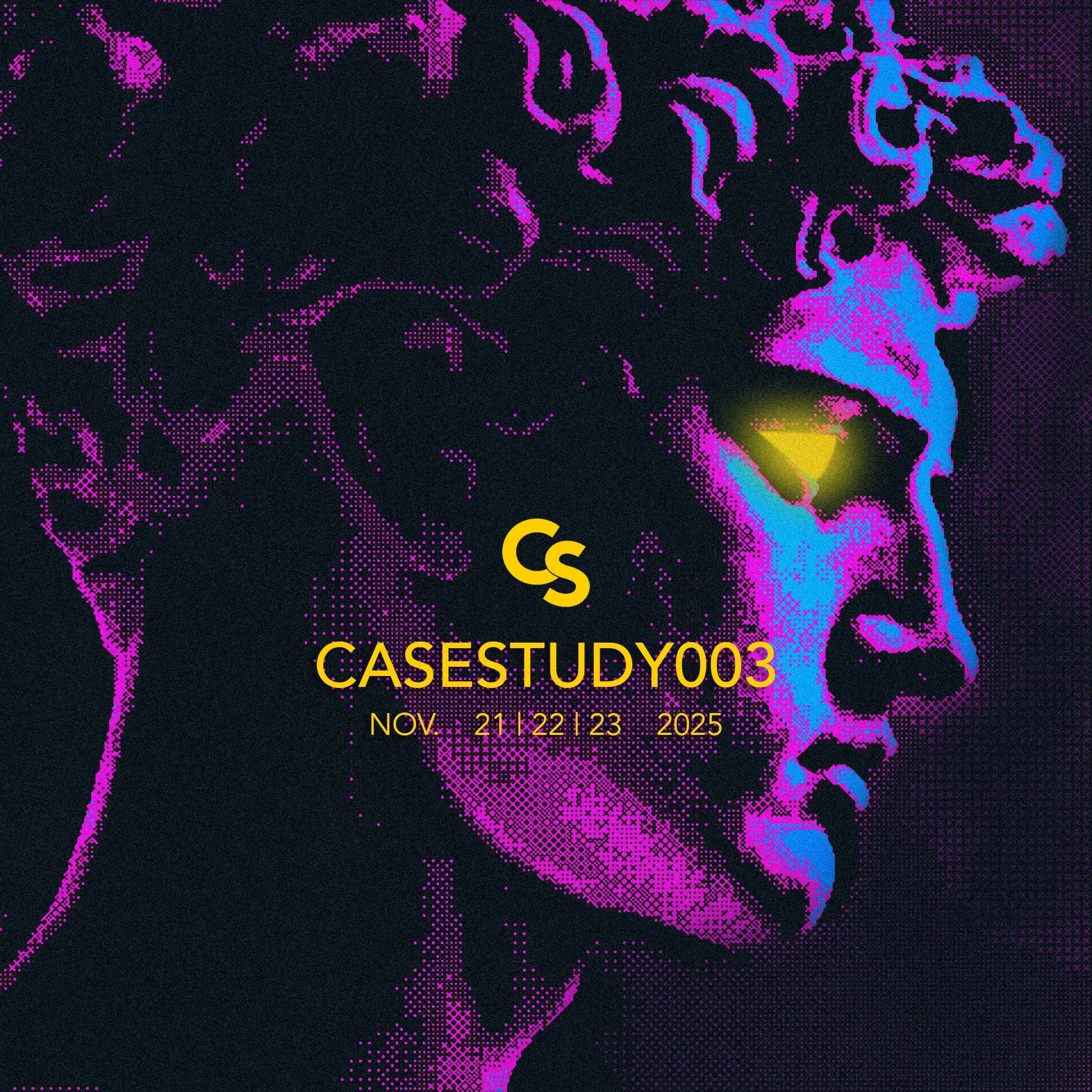
Case study 0 0 0 (2025)
Case Study is a three-day art festival based in Little Falls, New Jersey, created to celebrate art, conversation, and the creative community we’ve built over the years. Originally started by my friend Kanon and me, the event was never intended to be a polished or corporate production. Instead, the goal was to build an intimate atmosphere where artists could connect, network, and speak openly about their work and process.
My role in this project focused on developing a cohesive visual identity, communication tone, and event experience that captured the authenticity and raw creativity of the community.
The Challenge
The biggest challenge was designing branding that: Preserved the intimate, grassroots feel of the eventEncouraged people to interact with each other instead of only observing Supported a wide range of artists, mediums, and experiences Felt intentional without feeling overly produced or commercial We needed a brand that felt handmade, approachable, and community-first, yet still structured enough to guide communication and promotion.
Origin Story
Case Study began as a simple idea:
What if we hosted an event that allowed artists to genuinely talk, connect, and learn from each other—without all the pressure of a formal gallery or exhibition?
Kanon and I both wanted something small, authentic, and conversation-driven. Something that felt like a creative gathering rather than a traditional show. That mindset shaped every branding and design decision that followed.
Brand Inspiration
When developing the branding for Case Study, I wanted the identity to feel unmistakably like an event—not a gallery exhibition, not a formal art show, but something closer to the experience of going to a club, a party, or a DIY show. Something casual, raw, and communal.
So we started asking ourselves a simple question:
What visual elements instantly communicate “you’re entering an experience”?
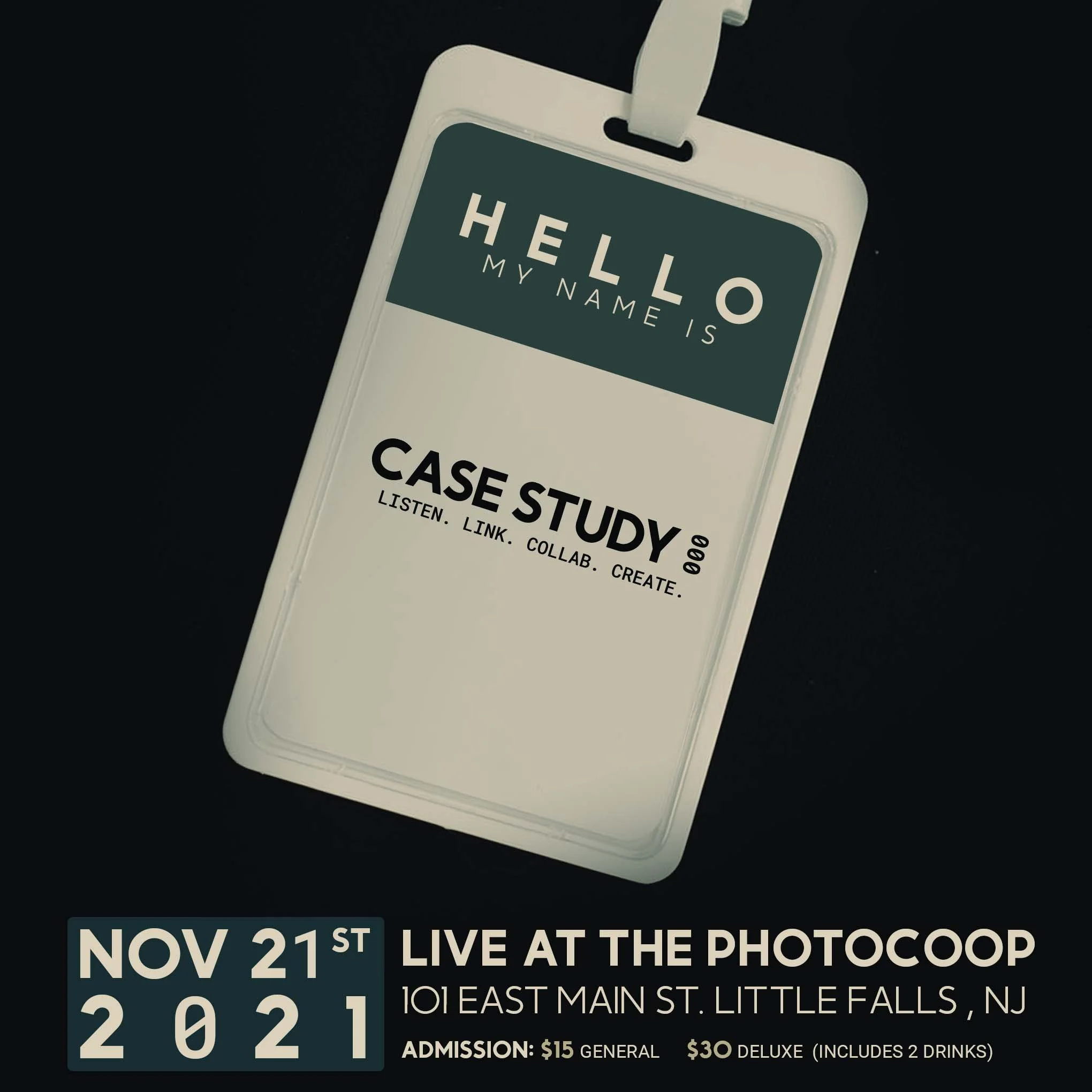
That exploration led us straight to two of the most iconic pieces of event culture:
Hand stamps
Wristbands
Both are universal, instantly recognizable, and tied to memory, nightlife, community, and belonging.
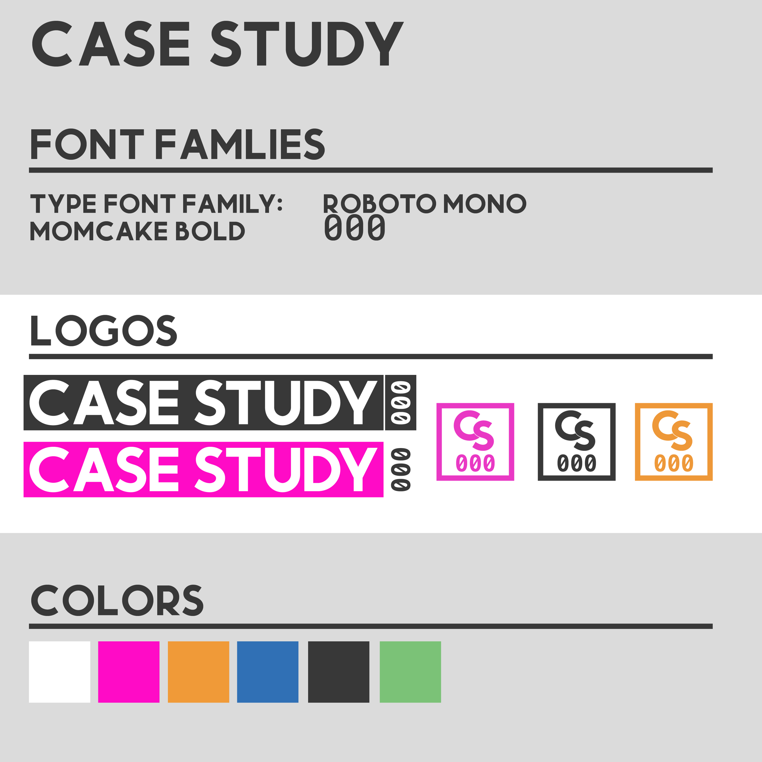
Logo Concept
The Case Study logo was built to echo the feeling of those stamped icons:
A bold, minimal wordmark that looks like it could be pressed, stamped, or printed on paper, flyers, or skin
Slightly imperfect spacing and structure to mimic the rough, real-world feel of stamped ink
A design that can be easily reproduced in one color for maximum versatility across surfaces
The goal was to create something that feels lived-in, not overly polished—because Case Study as an event is about presence, conversation, and human interaction.
The Wristband System
One of the strongest structural ideas we developed was a color-coded wristband system.
Each Case Study event receives:
Its own unique wristband color
Its own stamp or variant symbol
A visual “identity within the identity”
This system does two things:
Creates continuity
Each festival becomes instantly recognizable as part of the Case Study brand.Creates memory
Attendees can literally wear the branding—making it personal and collectible.
HOW DO YOU DEFINE A CHAOTIC VISUAL STORY
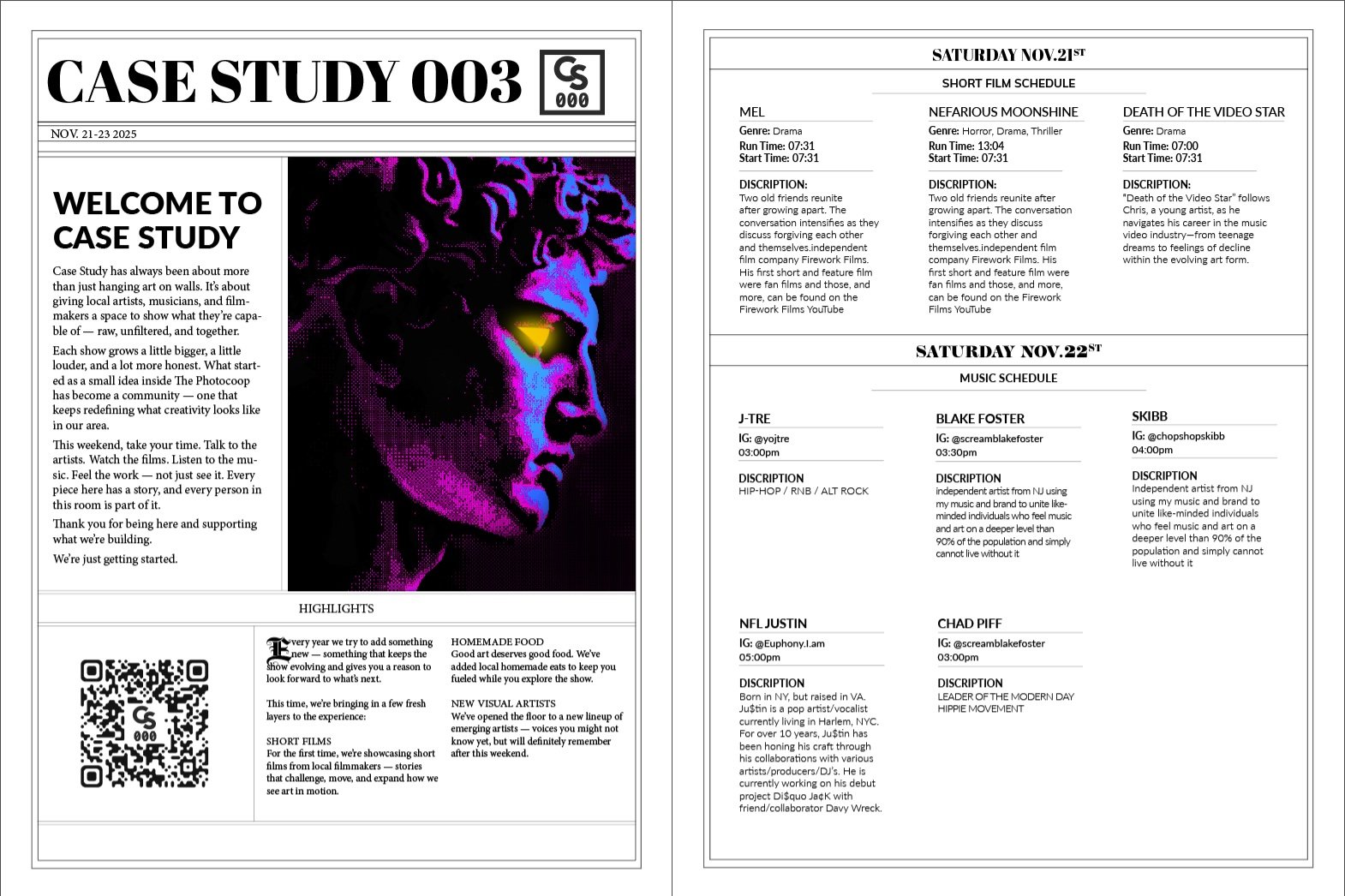
When it came time to create the graphic promo, the truth is that I never fully knew the exact direction—three years in, I was still figuring it out. What always felt right was putting as much raw creativity on display as possible and seeing where it led, and that approach naturally attracted the people the event was meant for: the weirdos, the visually hungry, the ones who crave stimulation, good conversation, and community. In 2023, the focus was on the social experience itself, so we designed name tags to make it easier for people to introduce themselves and connect. By the next year, I moved away from that approach and leaned into one of my biggest influences—Greek sculpture. I used the perfection of classical figures but added a melting effect to show vulnerability and flaw beneath the beauty. In the most recent show, I shifted again, this time centering pure creativity and learning how to build a “neither” effect for the imagery. Throughout these changes, the color palette naturally evolved into a pink, gold, and blue combination—not planned, but something that felt right after year two, so it became a part of the identity.


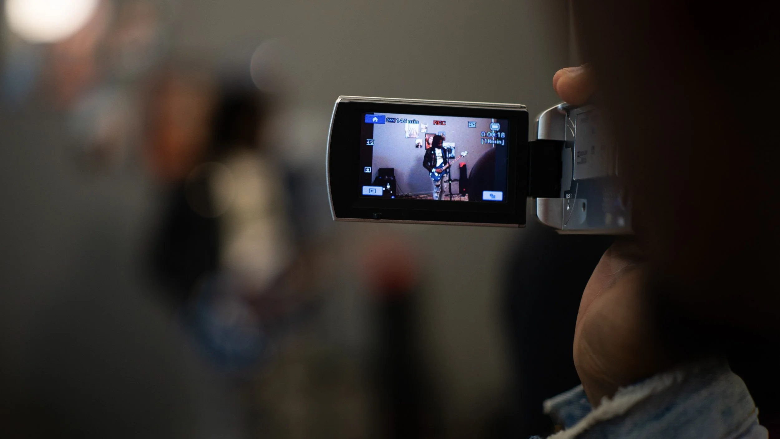
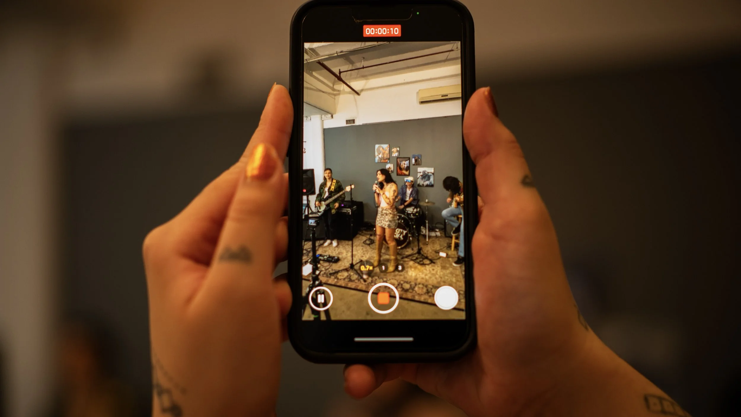
Photography & DP Direction
The visual identity for the photography and video direction was built around intimacy—capturing moments in a way that made viewers feel like they were right there with us. I wanted every frame to carry a warm, inviting energy, reinforcing that Case Study is a safe and open space for anyone who walks in. Even though the Instagram promos were intentionally vague to spark curiosity, the tone of the visuals balanced that mystery with comfort, making it clear that the event was approachable, welcoming, and rooted in genuine community. The softness, warmth, and closeness of the imagery helped communicate that feeling long before anyone stepped through the door.
Building the website
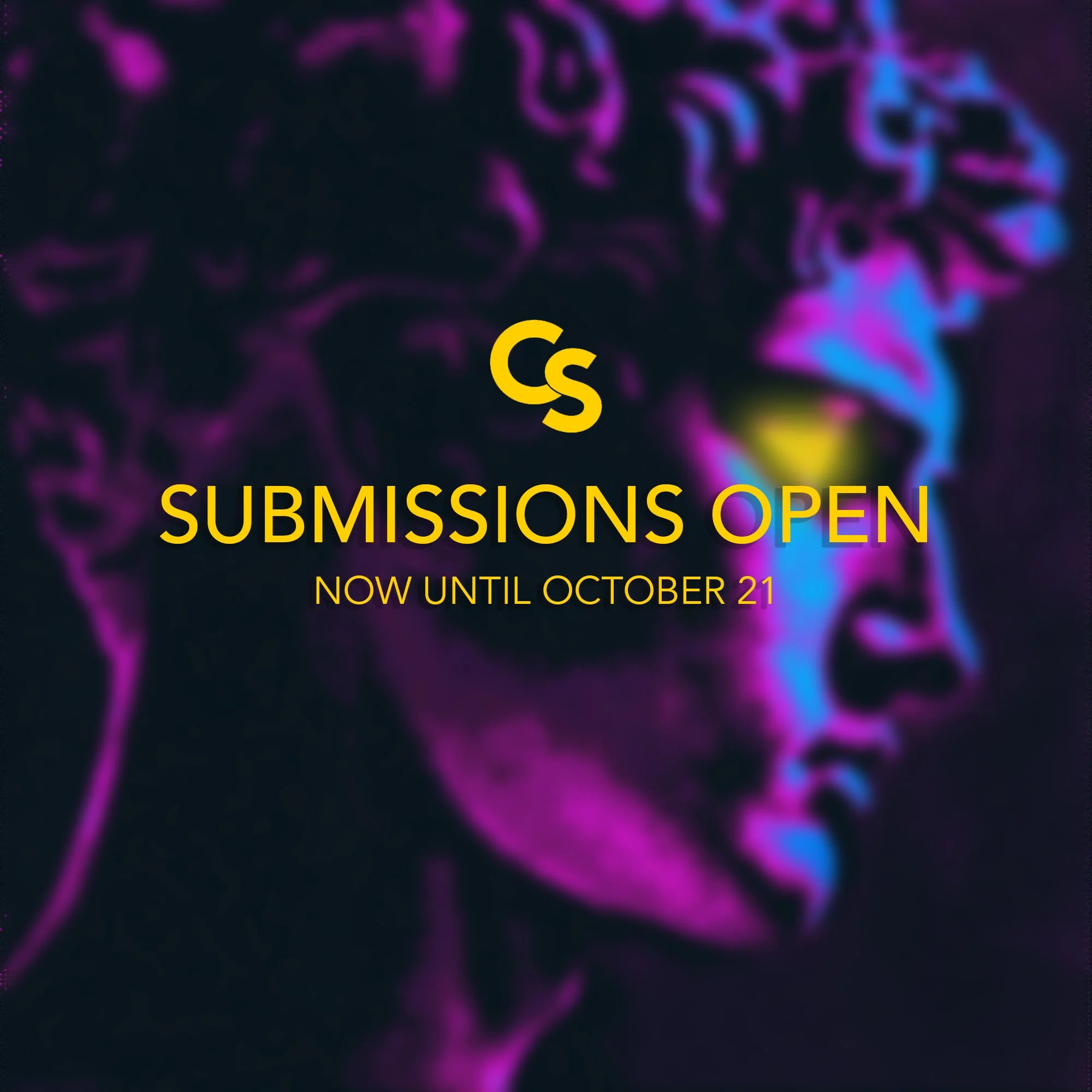
For the website, I needed something extremely easy to navigate since open artist submissions were a core part of the festival. The goal was to guide users directly to the submission form without confusion, so the design focused on clarity, simple pathways, and minimal distractions. We launched submissions in June, and while the process wasn’t perfect at first, the feedback we received shaped the site month by month. As people began submitting, we discovered issues—confusing language, unclear file requirements, broken flows—and made small, rapid adjustments to improve the experience. This cycle of testing, listening, and refining continued until about a month before production, and by that point the submission system felt stable, intuitive, and aligned with our mission. Even though the website evolved through trial and error, it ultimately became a functional extension of the festival itself: welcoming, accessible, and built with real artists in mind.

What Did I learn?
Working on Case Study over multiple years taught me a great deal about design, community, and creative iteration. I learned that branding isn’t just about aesthetics—it’s about crafting an experience that guides how people feel, behave, and interact. Iteration is key: from the website submissions to the visual identity, small adjustments based on real user feedback made the event stronger and more accessible. I also discovered the power of letting intuition lead creativity—sometimes the best decisions come from experimenting, leaning into influences like Greek art, and seeing what resonates rather than forcing a polished outcome. Finally, I learned how a brand can evolve organically over time, while still staying grounded in its core values: intimacy, creativity, and community. Case Study reinforced that design is as much about people as it is about visuals, and that giving space for experimentation can lead to unexpected and rewarding results.