GENLED BRANDS
(2017–2019)
Role: Graphic Designer – Branding & Marketing Assets
Overview
At GENLED Brands, I focused on creating and evolving branding assets for a small business client, supporting both their digital and print presence. Over time, my work expanded from core branding elements into email campaigns, product brochures, and detailed spec sheets, helping the sales team communicate clearly and consistently with clients


Key Projects & Deliverables
Branding & Identity: Developed visual guidelines, logos, and marketing graphics to strengthen brand recognition.
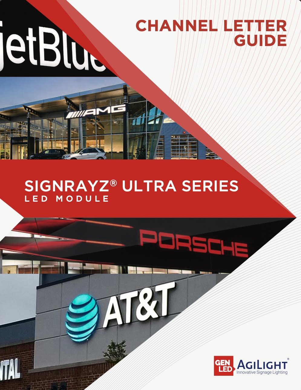
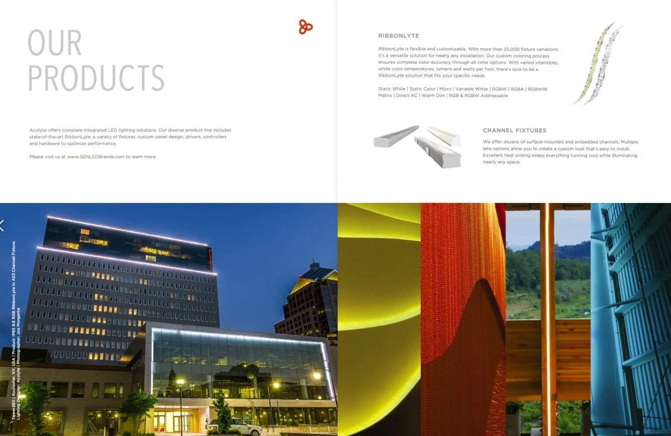
Print Design: Designed and rebranded product brochures and spec sheets for print, ensuring a consistent, polished look across all materials.
Digital Marketing: Created email blast templates and social graphics, aligning with the brand’s style and messaging.
Process & Approach
Much of my time at GENLED was spent iterating on brochures—both updating existing materials and creating new layouts from scratch—always keeping usability, hierarchy, and brand consistency in mind. My work balanced aesthetics with clarity, making sure the sales team could communicate complex product information efficiently.
Impact
Streamlined marketing materials for the sales team, improving clarity and professionalism.
Developed a cohesive brand identity across print and digital touchpoints.
Built flexible templates and layouts that could be adapted for future campaigns.

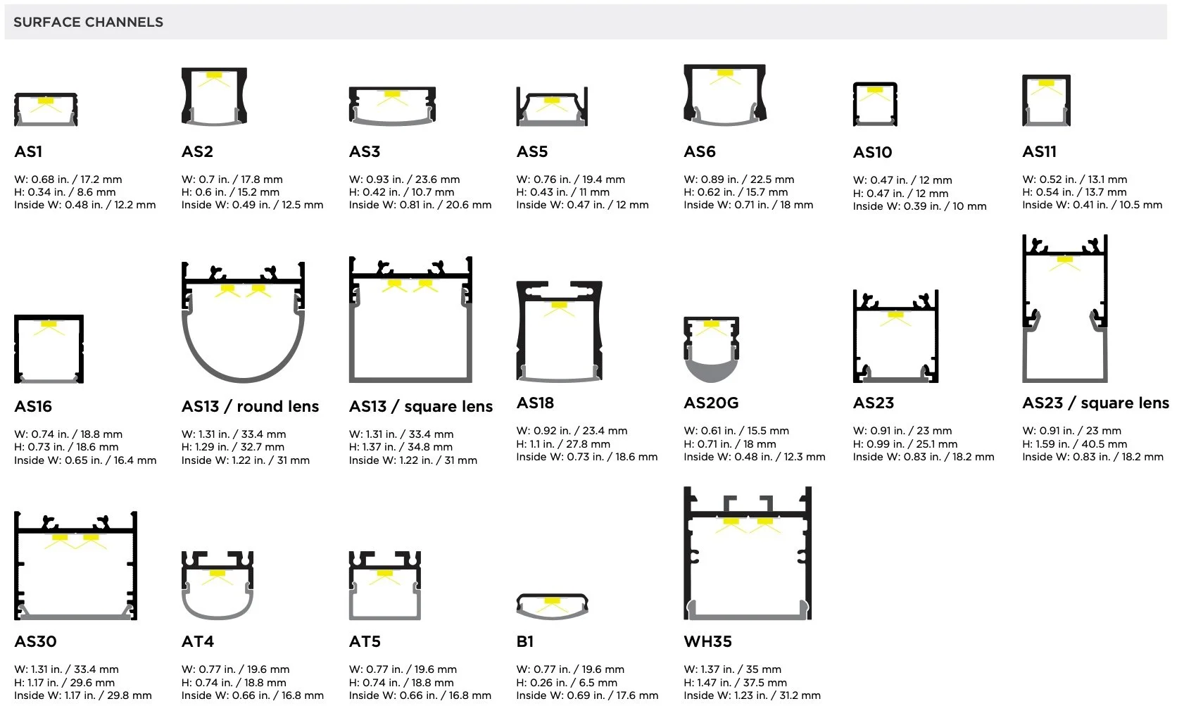
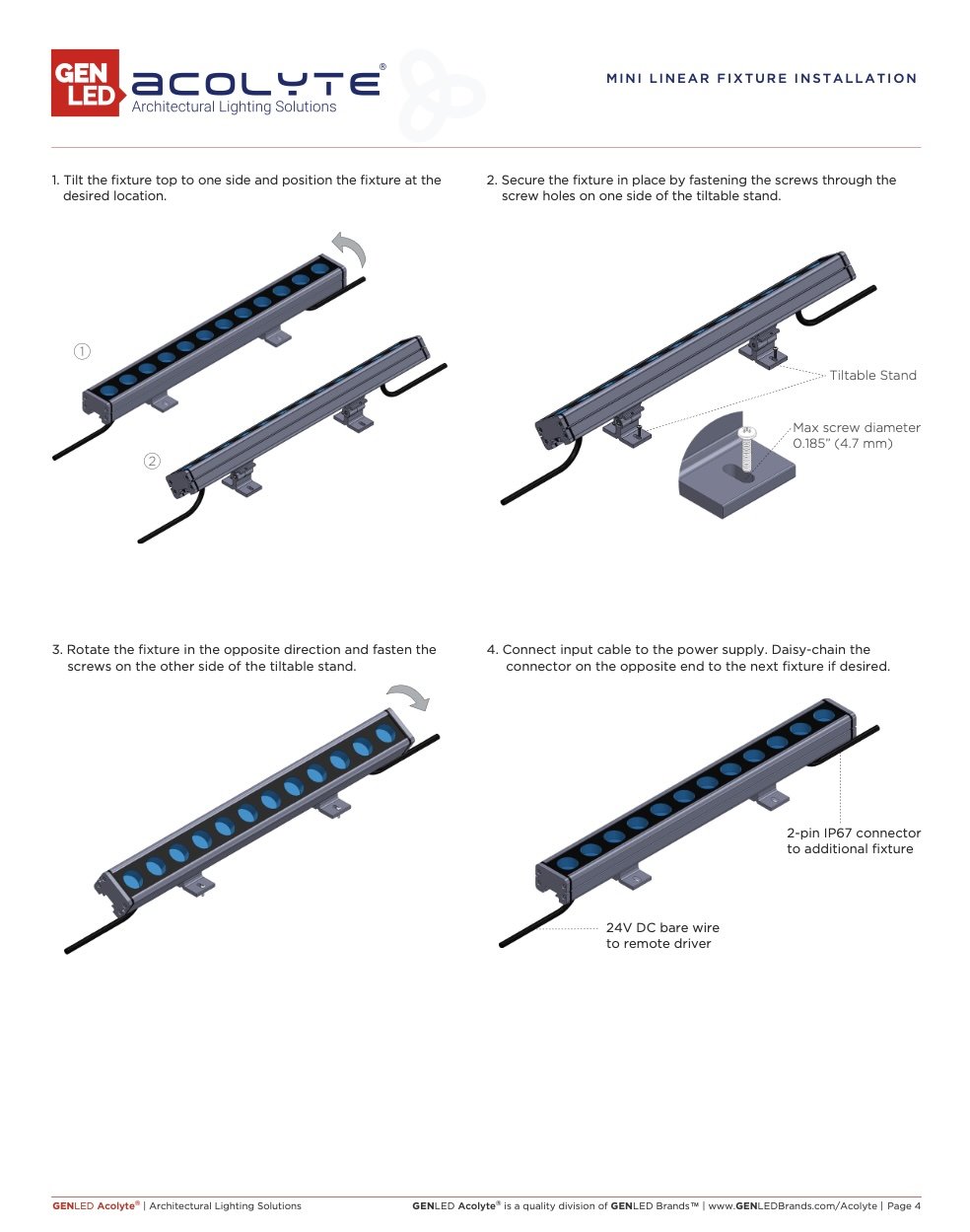
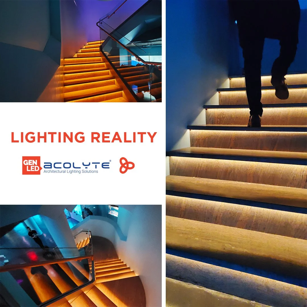
For GenLED Brands, I created product photography and technical diagrams used to build specification sheets for multiple products across both the AgiLight and Acolyte brands. The work focused on producing clean, accurate visuals that clearly communicate product form, dimensions, and details, while remaining consistent with each brand’s visual standards.
These assets were designed for use across both print and digital documentation, supporting sales, engineering, and marketing needs.
Brand Promotion & Visual Marketing
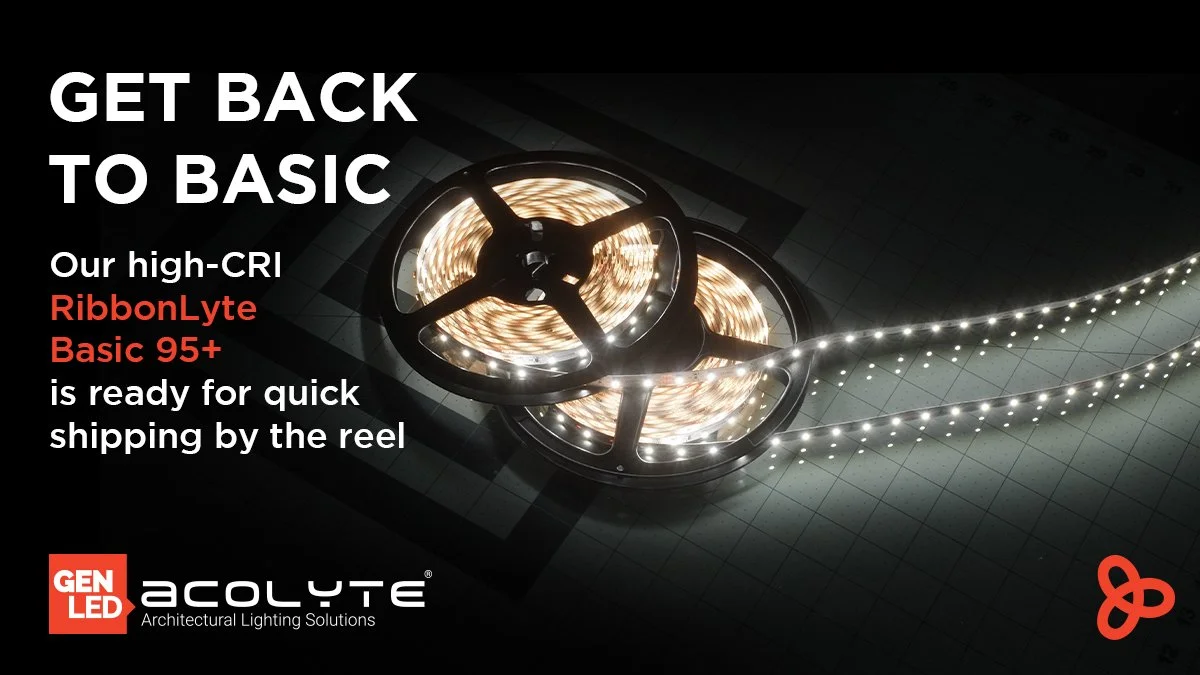
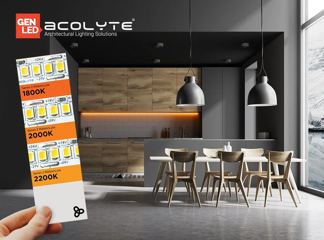
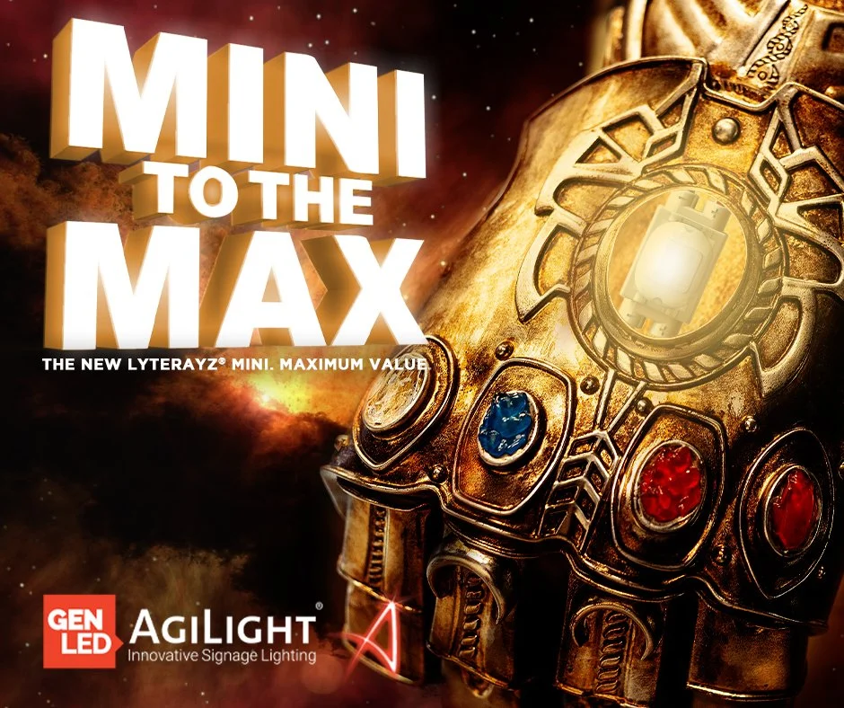
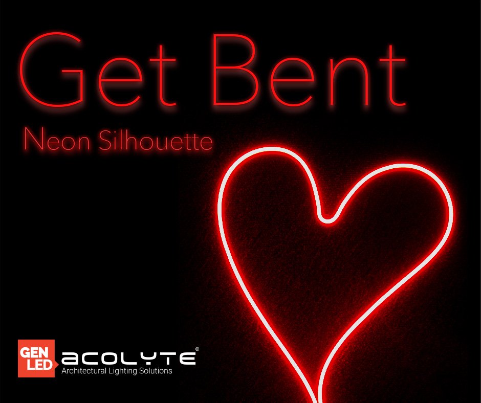
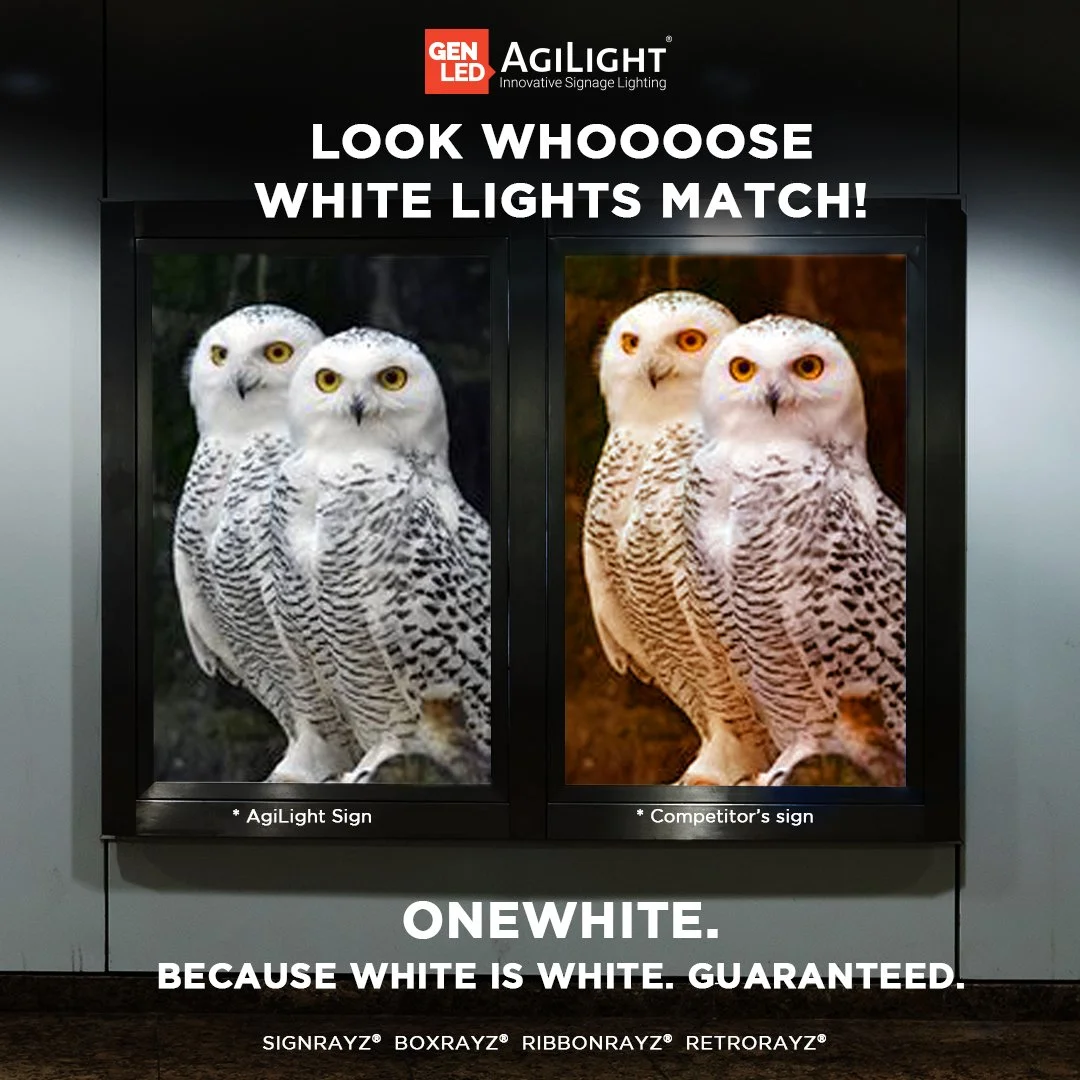
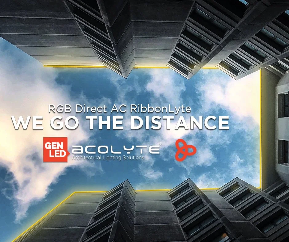
For GenLED Brands, I also designed refined social media promotional graphics to support the marketing of their LED products across LinkedIn, Instagram, and email campaigns. Each asset was crafted to maintain brand consistency while presenting the products in a clean, modern, and elevated visual style suitable for both professional and consumer-facing platforms.


WHAT DID I LEARN?
Working on Case Study over multiple years taught me a great deal about design, community, and creative iteration. I learned that branding isn’t just about aesthetics—it’s about crafting an experience that guides how people feel, behave, and interact. Iteration is key: from the website submissions to the visual identity, small adjustments based on real user feedback made the event stronger and more accessible. I also discovered the power of letting intuition lead creativity—sometimes the best decisions come from experimenting, leaning into influences like Greek art, and seeing what resonates rather than forcing a polished outcome. Finally, I learned how a brand can evolve organically over time, while still staying grounded in its core values: intimacy, creativity, and community. Case Study reinforced that design is as much about people as it is about visuals, and that giving space for experimentation can lead to unexpected and rewarding results.