
January 2022 to November 2022
Project Overview
When I joined Plott, their website and user interface lacked clarity, cohesion, and had usability issues. As a relatively young company with ambitious AR-powered tools, they needed a full redesign — both visually and functionally — to properly reflect their technology’s potential and streamline user onboarding, product discovery, and overall experience.
The goal was to create a clean, intuitive interface for their site and app — one that communicates complex functionality clearly and helps users easily navigate between measuring tools, AR design features, product info, tutorials, and purchasing.
My Role & What I Did
UX & UI Design — Redesigned the overall layout, navigation, and interface elements to improve usability, readability, and visual consistency.
Prototyping — Created high-fidelity prototypes using tools such as Figma and Adobe XD to experiment with flows, layout, and interaction patterns.
User Testing & Feedback — Conducted informal user testing to validate design decisions, identify pain points, and refine interactions and layout for better clarity and user satisfaction.
Visual & Information Architecture — Organized the site/app content so users can easily find product specs, AR capabilities, tutorials, and purchase options.
Tolls Used
Adobe XD, Figma, Mockup
THE
PROBLEM
Lets Plott offers two powerful AR-driven tools designed for the construction and landscaping industries—solutions capable of saving businesses thousands of dollars per project. However, the strength of these products also created a challenge: their usability was complex, the learning curve was steep, and users often struggled to understand the full value of the tools.
On top of that, Lets Plott wanted to highlight their flagship product as the centerpiece of their ecosystem, ensuring it stood out clearly from their secondary tools. The existing website and app interface didn’t support this goal. Information was scattered, product hierarchy was unclear, and users weren’t being guided through the experience in a way that built confidence or comprehension.
My task was to design a platform that simplifies these advanced technologies—creating a user experience that both educates new users and supports existing customers through intuitive product navigation, clear value communication, and a refined visual hierarchy that gives the flagship product the focus it deserves.
Key0-outcomes
A redesigned interface that clearly communicates what Plott offers: AR-driven measurement tools, digital mapping, and real-world implementation guidance.
Improved usability for both newcomers and experienced users — making it easier to understand the tools, navigate features, and purchase or download the app.
Cleaner, modern visuals that reflect Plott’s identity as an innovative, tech-forward brand bridging real and digital spaces.
Prototypes ready for further development and iteration, with groundwork laid for future features, updates, and scalability.
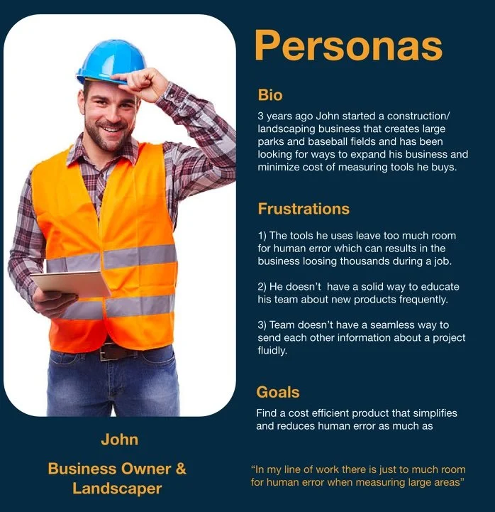
Getting to know the users
After gathering initial feedback, it became clear that the next critical step was to speak directly with real users. To better understand how different audiences interacted with Lets Plott’s tools, the team and I traveled to multiple trade shows across the country. There, we interviewed a wide range of people—from business owners interested in wholesaling Plott’s products to everyday consumers willing to purchase on the spot.
These conversations revealed consistent pain points that were directly impacting user confidence and conversion:
The website didn’t effectively educate users. Both professionals and DIY customers felt they didn’t have enough information to understand how the tools worked or how they could apply them to their projects. The client wanted to provide richer product details so users could make informed decisions before checkout.
The platform didn’t serve both DIYers and professionals equally. Each group had different needs, expectations, and levels of technical understanding. The existing experience wasn’t flexible enough to guide beginners while still meeting the depth required by industry professionals.
These insights helped shape the direction of the redesign—driving us to create a more intuitive, informative, and audience-aware experience.
What’s inside
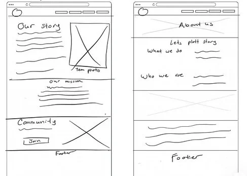
Lo-Fi Mockups & Iteration
With user insights in place, I began sketching low-fidelity wireframes to map out the core structure of the new experience. These early mockups allowed the team to quickly visualize layout ideas, test information flow, and validate whether the redesigned hierarchy supported both DIY users and professionals.
Through several rounds of rapid iteration—reviewing feedback, refining navigation, and adjusting content placement—we were able to establish a clear framework before moving into high-fidelity design.
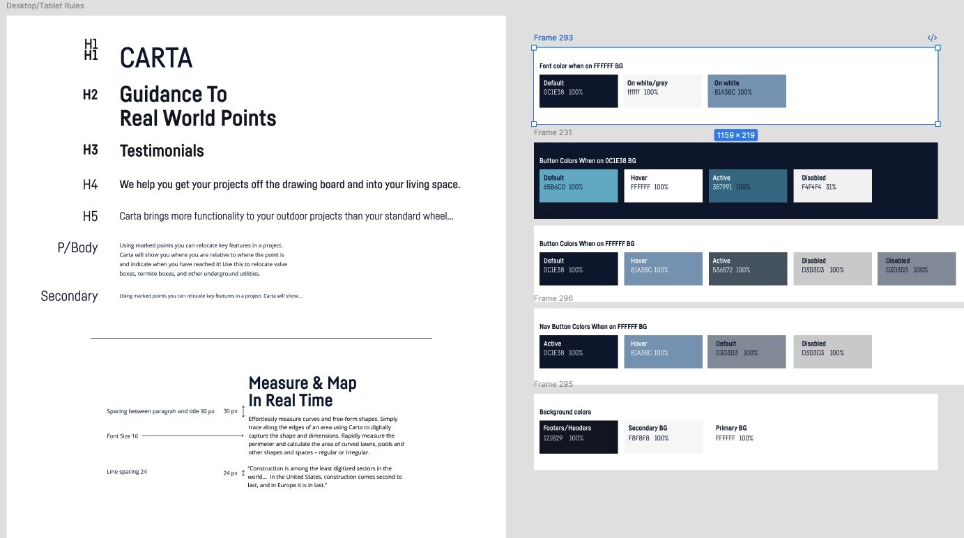
Light REBRANDING
The brand originally used a simple black-and-white color scheme. During the light rebranding of their products, I proposed updating the palette across the entire system, and the team agreed. I introduced blue accents—drawing inspiration from both Apple and Tesla—to complement the product and give it a more modern, intelligent feel.
This intern helped me build and plan their design library for all digital assets
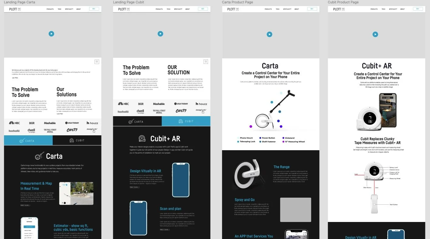
High-Fidelity Design
Once the structure was validated in the low-fi stage, I translated the wireframes into high-fidelity designs that reflected Plott’s brand identity and product tone. The goal was to balance a technical, tool-driven aesthetic with a clean and approachable interface. I refined visual hierarchy, introduced consistent iconography, and created modular UI components that could scale across multiple product pages. This stage also focused on clarity—ensuring every feature, measurement tool, and workflow was represented with intuitive visuals and straightforward language.
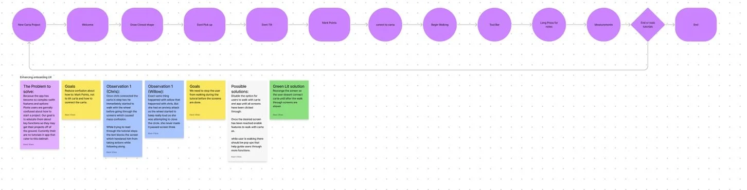
Interactive Prototyping
With the final layouts established, I built an interactive prototype to demonstrate real user flows—product discovery, feature exploration, checkout, and app walkthroughs. This prototype allowed stakeholders to experience the redesigned site as users would, enabling faster decisions and clearer alignment. It also helped the team identify friction points early, such as unclear terminology and steps that needed additional cues or micro-interactions.
User Testing & Feedback Loop
We conducted usability sessions with both DIY users and industry professionals to validate whether the new experience matched their expectations. Testers responded positively to the improved navigation, detailed product education sections, and simplified checkout flow. Feedback also highlighted areas for optimization, such as reorganizing feature comparisons and adding more contextual examples of the tools in real projects. These insights informed the final round of refinements before development handoff.